
AI Design Handoff Workflow 2026: Figma AI, Framer, Canva AI, Napkin AI, and v0 From Approved Concept to Build
Last updated: July 31, 2026 · Category cluster: AI design tools
A polished mockup is not a handoff. It can win approval in a review and still leave engineers guessing about loading, empty, error, permission, mobile, keyboard, and long-content states. Add AI-generated screens and the gap gets wider: a layout may look internally consistent while using invented data, one-off components, impossible interactions, or copy that nobody approved. The pixels appear finished. The decisions are not.
This guide is for product designers, design-system owners, product managers, front-end engineers, agency teams, and small software companies that need to move from an approved concept to a buildable interface. It centers on Figma AI for design files and component work, Framer for responsive interaction checks, Napkin AI for visualizing flows, and Canva AI for controlled launch and help assets. We also examine where interface generators such as v0 fit without allowing generated code to become an unreviewed specification.
Our working rule at findaiverse is simple: handoff quality is measured by the number of questions a team can answer before implementation, not by the realism of one hero screen. A useful AI design handoff preserves intent, states, content rules, accessibility expectations, component identity, ownership, and test evidence. It gives developers room to solve engineering details without forcing them to reverse-engineer product decisions from a screenshot.
- Handoff starts with decisions — audience, job, data, states, permissions, content limits, and success conditions should exist before high-fidelity screens.
- Generated layouts are proposals — map every accepted element to a real component, token, behavior, and owner before development.
- Show state families, not happy paths — loading, empty, error, offline, partial, destructive, and access-denied states expose the real product.
- Pair annotations with executable checks — acceptance criteria, keyboard order, responsive examples, sample payloads, and test IDs reduce interpretation.
- Keep one source of truth — a handoff is not finished while rules are split across a mockup, chat thread, generated prototype, and private prompt history.
Why AI-generated screens widen the design-to-build gap
Traditional mockups already hide behavior. A static checkout page does not show a delayed payment response, an expired cart, an unavailable delivery option, a field-level validation message, or what happens after a user presses the button twice. AI-generated mockups add another problem: they fill gaps with plausible details. A chart gains believable values. A table gains filters. A settings page gains a role picker. Those additions look intentional even when nobody requested them.
That plausibility changes review behavior. Stakeholders often comment on color, density, and wording because the screen seems complete. They are less likely to ask where the data comes from or whether the new control exists in the permission model. Engineers receive the approved frame and discover that half the interface has no corresponding API, event, state, or component. Product then makes decisions during implementation, where they are expensive and poorly documented.
Separate three kinds of truth. Product truth describes what the user can do, under which conditions, and with what result. System truth describes data shape, latency, permissions, limits, and failure behavior. visual truth describes hierarchy, typography, spacing, color, motion, and responsive treatment. An AI tool may suggest any of the three, but a named owner must approve each one.
The gap also grows when teams confuse speed with readiness. Figma AI may help produce a first direction, while v0 can make an interactive code draft and Framer can put a responsive concept in a browser. Those are useful forms of evidence. They do not prove that the production stack, data model, performance budget, analytics, security, localization, or accessibility requirements have been met.
A better definition of done is “decision-complete enough to start,” not “looks final.” The team should know the primary job, allowed actions, component family, essential states, mobile behavior, content rules, accessibility target, API assumptions, unresolved questions, and acceptance criteria. Unknowns can remain, but they should be visible and assigned.
The findaiverse design tools hub can help you compare creation environments. Before choosing one, identify where uncertainty sits. If people do not understand the flow, map it. If responsive behavior is unclear, prototype it. If the component library is inconsistent, repair that source before generating more screens.
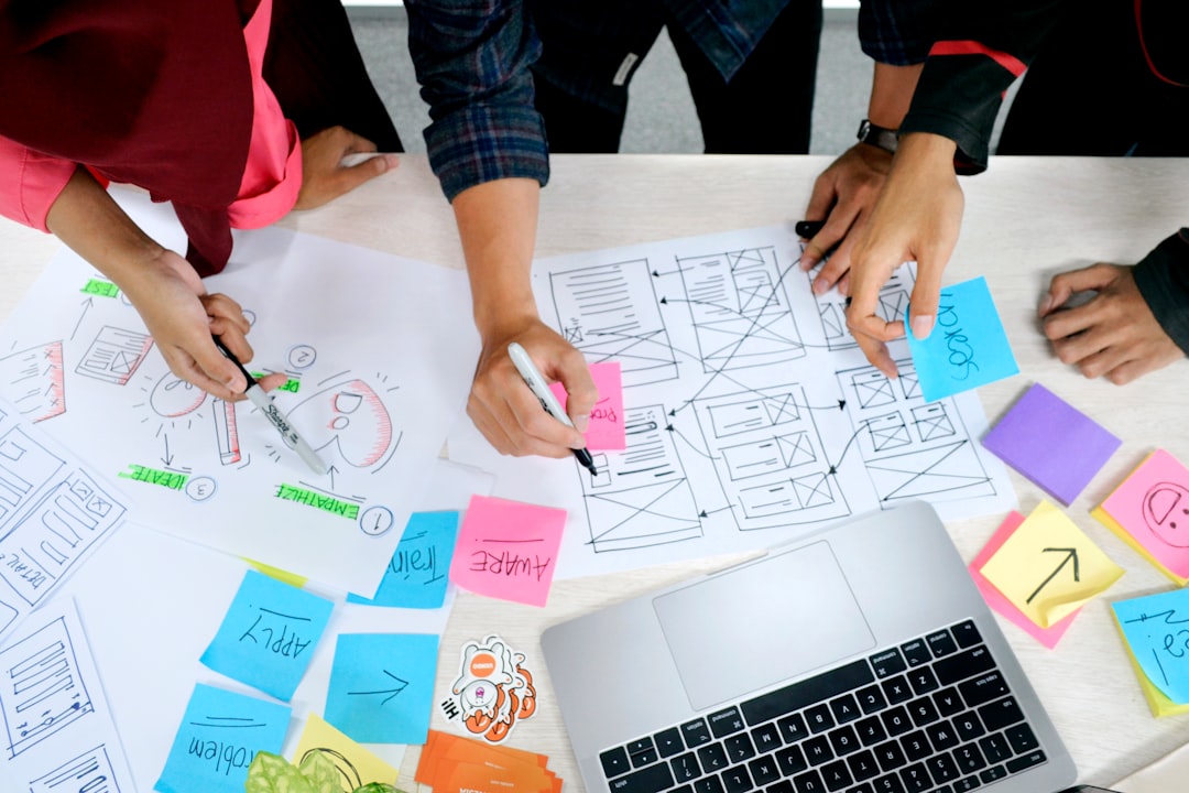
Build a decision packet before polishing screens
A decision packet is the smallest set of documents that explains why the interface exists and how it behaves. Keep it close to the design file. Start with a one-paragraph user situation: who arrives, what they know, what they need to accomplish, what can block them, and what should be true when they leave. “Manage invoices” is vague. “A finance administrator finds three overdue invoices, checks disputed line items, sends one approved reminder, and exports an audit record without exposing another business unit” is testable.
Add a scope boundary. List what this release includes, what it deliberately postpones, and what the generated concepts must not introduce. AI screen generation tends to expand scope quietly because complete-looking dashboards include search, filtering, bulk actions, export, sorting, personalization, notifications, and role controls. If bulk edit is out, say so. If a report is sample-only, label it. If mobile supports review but not creation, record that split.
Next comes a flow map. Use Napkin AI to turn a written sequence into a first diagram if that helps the team see branches, but rebuild the accepted flow with accurate labels and ownership. Mark entry points, user actions, system actions, decisions, wait states, exits, notifications, and recovery paths. A straight happy-path arrow is not enough.
Create a state inventory beside the flow. For each screen or component, ask about initial, focused, edited, saved, loading, empty, partial, success, warning, error, offline, read-only, disabled, expired, and access-denied behavior. Not every component needs every state. The question forces an explicit decision. Attach examples of long names, missing images, zero values, large values, unsupported file types, and translated text expansion.
Write a content model rather than final copy alone. Define field purpose, source, maximum useful length, required status, format, truncation rule, empty fallback, localization note, and owner. The button label “Send” cannot be reviewed properly until the team knows what is sent, to whom, whether the action can be undone, and what confirmation follows. Content design is behavior design.
Finish the packet with success and safety. State the primary outcome, analytics event, performance expectation, accessibility target, irreversible actions, private data shown, and audit requirement. Link to the issue, API discussion, research evidence, and open questions. A two-page packet that answers those matters is more useful than fifty unannotated frames.
Figma AI, Framer, Napkin AI, Canva AI, and v0 compared
| Handoff job | Good starting tool | Useful evidence | What still needs human approval |
|---|---|---|---|
| Screen families, components, variants, tokens, comments | Figma AI | Named components, state variants, layout rules, inspectable measurements, linked prototypes. | Product behavior, component mapping, token use, responsive logic, accessibility, and final copy. |
| Responsive page behavior and browser-based interaction | Framer | Real breakpoints, content reflow, hover and focus ideas, page rhythm, stakeholder preview. | Production architecture, semantics, tracking, forms, data flow, performance, and security. |
| Flow, dependency, service, and state visualization | Napkin AI | A discussion-ready map of branches, actors, stages, inputs, and outputs. | Accurate sequence, missing exceptions, system ownership, labels, and decision meaning. |
| Launch graphics, onboarding cards, support visuals, and templates | Canva AI | Editable channel variants built from approved interface assets and brand rules. | Product accuracy, current screenshots, localization, image rights, alt text, and export size. |
| Interactive front-end spike and component behavior discussion | v0 | Runnable idea, event flow, responsive questions, quick engineering critique. | Dependencies, code quality, semantics, test coverage, security, state ownership, and integration plan. |
Use Figma as the main design record when product UI and a shared component library matter. AI assistance can reduce file chores and speed early exploration, but accepted output should be converted into the team’s real component and token language. The official Figma AI overview is the right place to confirm current capabilities and availability; feature lists and plan access change.
Framer is useful when a flat prototype hides too much. Put representative content into a browser, narrow the viewport, enlarge text, tab through controls, and test the page with a slow connection. A marketing page may ship directly from Framer, while an application screen may only use it as an interaction study. Label that status so stakeholders do not mistake a concept URL for production.
Napkin AI can shorten the distance between a paragraph and a visible process. It is most valuable before high fidelity, when the team needs to challenge order and ownership. Treat its diagram as a draft. If an arrow says “system validates,” name the system, input, result, failure, and next actor before handoff.
Canva AI sits after product approval more often than before it. Teams need launch cards, help-center illustrations, social images, webinar slides, and app-store graphics. Feed those templates approved screenshots and claims. Keep screenshots linked to a release and expiration date so an old interface does not survive in marketing for a year.
v0 and similar interface generators can bring engineers into the conversation early. Ask for a disposable spike around the riskiest interaction, then review the output rather than copying it wholesale. The spike may reveal that a menu needs keyboard support, a table needs virtualization, or a mobile flow needs a different information order. Its job is to expose questions.

A twelve-step AI design handoff workflow
- Name the user decision. Write the job, context, entry condition, expected outcome, and one thing the interface must never cause.
- Set the release boundary. List included actions, deferred actions, platforms, roles, data, and AI-suggested features that are explicitly out.
- Map the full flow. Show entry points, actions, system responses, branches, waits, exits, and recovery. Assign an owner to unresolved nodes.
- Inventory data and content. Record source, format, sensitivity, limits, empty values, localization needs, and whether sample data may appear in design files.
- Generate low-cost directions. Use AI for a few structurally different layouts. Hold the task and content constant so reviewers compare hierarchy rather than decoration.
- Select with written reasons. Approve information order, interaction pattern, and component family. Reject invented controls, fake metrics, and one-off visual tricks.
- Map to the real design system. Replace generated elements with library components and tokens. Create a new component only when its purpose cannot be met by an existing one.
- Build the state family. Design happy, loading, empty, partial, error, offline, permission, destructive, and long-content examples that apply.
- Test responsive and input behavior. Check phone, tablet, wide display, zoom, keyboard, touch, pointer, focus, and reduced-motion assumptions.
- Review with engineering and content. Confirm API assumptions, state ownership, semantics, performance risks, copy, analytics, logging, and unresolved technical choices.
- Write acceptance evidence. Add behavior criteria, screenshots only where useful, sample payloads, analytics names, accessibility expectations, and test cases.
- Freeze a handoff snapshot. Tag the approved file and issue, record open questions and owners, then route later changes through a visible decision log.
Run these steps on one vertical slice, not an entire application. A useful pilot might be “search, no results, filter, result selection, permission failure, and return.” Count handoff questions by type: missing state, unclear copy, component mismatch, API gap, responsive ambiguity, accessibility issue, or scope change. The count is more informative than asking whether developers “liked the design.”
Create a trap set during the pilot. Use a 70-character name, an empty avatar, a right-to-left locale, a zero value, a five-digit count, a missing permission, a slow request, an expired object, and a destructive action. The design should absorb these cases without an emergency redesign. If it cannot, the handoff is showing a demo rather than a product.
Turn layouts into a design-and-development contract
The word “contract” does not mean a rigid wall between design and engineering. It means both sides can point to the same named behavior. For every interactive component, record trigger, precondition, visual response, data response, completion, failure, cancellation, focus destination, and analytics event. A modal is not specified by width and corner radius. It is specified by why it opens, how it closes, where focus goes, what background interaction is blocked, and what happens when the request fails.
Map design components to code components. The mapping can be a simple table with Figma name, code name, package, version, owner, supported variants, known gaps, and documentation link. AI-generated designs frequently create “near components”: a card that resembles the system card but changes padding, heading order, status placement, and action count. Near components create drift. Either map the layout to the existing card or approve a deliberate extension.
Tokens need semantic names. “Purple 500” describes a color value; “action-primary-background” describes a purpose. Handoff should show which semantic token applies and what happens in dark mode, high contrast, hover, focus, selected, and disabled states. Do not ask engineers to sample a generated pixel. A screenshot is a consequence of tokens, not their source.
Responsive annotations should explain priority rather than prescribe dozens of coordinates. State what stays, moves, wraps, collapses, scrolls, becomes a menu, or disappears—and why. Show at least one narrow and one wide example with real content extremes. For tables, decide whether columns hide, cards replace rows, horizontal scrolling appears, or the task moves to another screen. “Make responsive” is not an acceptance criterion.
Separate server state, client state, and visual state. A disabled button may mean insufficient input, insufficient permission, pending request, reached limit, or unavailable service. Those causes need different help and logging. Generated prototypes often represent all of them as reduced opacity. The contract should preserve meaning.
Give implementation questions a home. Keep a short decision log linked from the design and issue. Record date, question, options, decision, people involved, and affected components. Do not leave the final answer in a private AI chat or a transient call. Future designers and engineers need to know why a pattern differs.

Accessibility, content, data, and review evidence
Accessibility should enter before visual polish. The W3C Web Content Accessibility Guidelines 2.2 provide testable success criteria rather than a vague request to “make it accessible.” Choose the conformance target that applies to your organization, then translate relevant criteria into design and implementation checks. Do not claim compliance from a mockup review alone.
Include heading order, accessible names, error identification, instructions, status announcements, focus order, visible focus, target size, contrast expectations, zoom and reflow, motion alternatives, and timeout behavior where relevant. If a chart conveys meaning, provide the data or a textual alternative. If color indicates status, add a label, icon, pattern, or position that survives without color.
Test keyboard flow in the prototype or early build. Write the expected sequence for complex widgets and state where focus moves after opening, closing, adding, deleting, saving, or failing. Generated code may use clickable containers or visual order that differs from DOM order. A visual review will not catch that. Inspect semantics in the actual build.
Content evidence matters just as much. Mark approved copy, placeholder copy, generated copy, and system-generated values differently. Name the copy owner. Supply realistic examples and length boundaries. A beautifully balanced card with two-word placeholders proves little about a support queue containing long customer names, timestamps, translated statuses, and multiline subjects.
Protect data in design tools. Do not paste live customer records, private tickets, unreleased financial results, credentials, health details, or employee information into a generator because the mockup needs realism. Use a documented synthetic dataset with representative lengths and edge cases. Record which external tools may receive company material and under what account settings.
Review AI-made visuals for unsupported claims. A dashboard chart is a claim. So is an interface screenshot that displays a feature not in the release. Launch assets built in Canva AI or edited with Adobe Firefly should retain a link to the approved product state and source assets. Label conceptual screens as concepts.
End review with evidence, not a meeting memory. Attach checks, known exceptions, test owners, unresolved items, and the build where verification will happen. Design can define the expected result, but many accessibility, performance, analytics, and security claims require implementation testing.
Field notes from findaiverse curation
While organizing the design category, we found that broad feature lists say little about handoff. A tool may generate pages, diagrams, images, or code, yet the real question is what survives after the first draft. Can the team map the result to components? Can it edit every meaningful word? Can it test a state? Can another person trace the source? Can the artifact move into the team’s normal review system?
We now review a design tool with a small artifact chain. We begin with a written task and a state list. We create a low-fidelity direction, move one accepted idea into a component-based design, test one narrow responsive view, and produce one launch or help asset. We record where information is lost between tools. That loss—more than the quality of the first image—predicts handoff pain.
One repeated failure is prompt-only history. The creator remembers why an element exists, but the next person sees only the output. Prompts are useful provenance; they are poor specifications. Convert accepted reasoning into component notes, flow states, content rules, or acceptance criteria. Delete rejected ideas from the active handoff board so they do not return as accidental requirements.
Another failure is the prototype that becomes production by momentum. A generated code sample impresses the room, an engineer copies it, and the team spends the next sprint repairing dependencies, semantics, state handling, and tests. Mark experiments as disposable. If a spike is worth keeping, review it under the project’s normal code rules before calling it a foundation.
We also prefer fewer screens with deeper states. Twelve versions of the happy dashboard are less useful than one dashboard showing loading, no permission, stale data, partial failure, keyboard focus, narrow width, and a long translated label. Variation should expose uncertainty, not merely style.
For a first test, choose a feature with one read action, one write action, and one failure path. Compare Figma AI, Napkin AI, and either Framer or v0 only where each adds evidence. Use the AI design category to inspect alternatives, then keep the stack small.
Disclosure: findaiverse lists free and paid AI products. This is independent editorial guidance, not paid placement. Features, plan access, data terms, export formats, and pricing can change. Check each vendor’s current documentation and run a security, legal, and accessibility review suitable for your product.
Frequently asked questions
What is an AI design handoff workflow?
An AI design handoff workflow is a documented process for turning AI-assisted flows, layouts, prototypes, and assets into buildable product decisions. It maps accepted output to real components and states, records content and data rules, adds accessibility and responsive expectations, assigns owners, and gives engineers testable acceptance evidence.
Should a generated prototype be included in handoff?
Yes, if it answers a named question. A prototype can show responsive reflow, animation, focus movement, or a complex sequence better than static frames. Label whether it is a disposable study or an implementation candidate. Engineers should not infer production dependencies, security, semantics, or test readiness from visual behavior alone.
Which tool should be the source of truth?
For most product teams, the approved issue and component-based Figma file form the design record, while the codebase is the final record of implemented behavior. Framer, Napkin AI, Canva AI, and generated code can provide supporting evidence. Pick one linked handoff index so people do not search five tools for the latest rule.
How many screens should a good handoff contain?
There is no useful fixed number. Include enough screens and component examples to cover the task, meaningful state branches, responsive priorities, and risky interactions. One deeply specified flow can be better than dozens of polished frames. Count unanswered decisions and missing states rather than screens.
Final recommendation
Take one approved feature and run a handoff audit before adding another generator. Remove invented controls, map every accepted element to the design system, add the missing state family, test narrow width and keyboard order, attach realistic content, and write acceptance criteria. Then ask engineering to identify every remaining guess.
The best AI design handoff does not make designers disappear or force developers to reproduce pixels. It creates a shared, inspectable record of intent and evidence. Browse the findaiverse AI tools directory, compare candidates in the Design hub, and use each tool only where it answers a question your team actually has. A smaller artifact chain with explicit decisions will beat a gallery of finished-looking guesses.