AI Landing Page Design Workflow 2026: Framer, Figma AI, Canva AI, Napkin AI, Photoroom, and Gamma for Faster Campaign Pages
Last updated: 2026-07-04 · Design
A landing page that looks good in an AI demo can still lose the campaign. The hero is attractive, the gradient feels modern, the sections are balanced, and the mockup looks polished. Then real traffic arrives and the problems appear: the headline could describe any product, the form breaks on mobile, the product screenshot shows a feature that has not shipped, the CTA is buried below a large illustration, and the analytics event was never connected. AI made the first draft faster. It did not make the page ready.
This guide is for founders, growth marketers, product marketers, designers, and small agencies that need to publish more campaign pages without turning every page into a design sprint. The focus is the findaiverse Design tools category: Framer for page generation and publishing, Figma AI for product visuals and design-system work, Canva AI for campaign graphics, Napkin AI for diagrams, PhotoRoom for product images, and Gamma for shaping the narrative before the page goes live.
The best AI landing page workflow does not start with a blank prompt. It starts with a sharp page brief, a small tool stack, an honest proof checklist, and a publishing owner. AI should help you see options quickly. Humans still need to decide what the page promises, which evidence deserves space, and what must be true before traffic is sent to it. That separation is the difference between fast design and fast waste.
- Treat AI page builders as draft accelerators — Framer can move you from idea to editable page quickly, but forms, tracking, mobile, accessibility, and claims still need review.
- Keep product truth in Figma — use real screenshots, component rules, and approved states instead of letting a generator invent a cleaner product than you sell.
- Design the proof path — testimonials, screenshots, diagrams, pricing, and security notes should answer reader objections in the order they appear.
- Publish with a checklist — a landing page is not done until speed, metadata, alt text, events, links, legal copy, and fallback states are checked.
Why AI landing pages fail after the first draft
The first draft is the easiest part of a landing page. AI tools can create a hero, feature sections, pricing cards, testimonials, FAQ blocks, and a footer in minutes. That is useful. The failure happens when the team treats layout as strategy. A page does not convert because it contains familiar sections. It converts because the right reader sees a problem, believes the offer, trusts the proof, and can act without friction.
Most AI-generated pages are too generic in the middle. The hero says the product saves time. The feature cards say the platform is easy, smart, and flexible. The testimonial says the tool changed everything. None of that is wrong, but none of it gives a buyer a reason to stop comparing. Good campaign pages need specific tradeoffs: who the page is for, what the buyer has already tried, what the tool replaces, what proof is available, and what action should happen next.
The second failure is visual truth. Figma AI can speed up product mockups, but a landing page cannot show a fantasy interface. If the screenshot, chart, workflow, or integration panel is cleaner than the real product, the page becomes a promise the product team did not approve. PhotoRoom and Remove.bg create cleaner product images, but they should not make a product look larger, newer, bundled, or more premium than it is.
The third failure is publishing discipline. A page may look finished inside Framer, but public pages also need SEO metadata, fast images, working forms, clear privacy text, event tracking, responsive behavior, and readable contrast. The Design category on findaiverse is helpful because it separates the creative tool from the operations around it. A fast draft is a start. A reliable page is a system.
Write the page brief before opening Framer or Figma
A useful landing page brief fits on one screen. Write the audience, campaign source, primary CTA, reader pain, offer, proof assets, objections, required screenshots, forbidden claims, legal notes, deadline, and owner. If the page has paid traffic behind it, include the ad promise. If the page is for a launch, include the product status. If the page is for enterprise buyers, include security and procurement concerns. The brief is where you decide what the page is allowed to say.
The audience line should be narrow. A page for solo creators should not sound like a page for procurement leaders. A page for developers should not hide implementation details behind a lifestyle hero. A page for ecommerce operators should show operational proof: product data, listing examples, returns, marketplaces, and before/after images. The more specific the reader, the easier the design choices become.
Next, name the proof path. A landing page is a sequence of trust. The hero answers why the visitor should keep reading. The next section explains the before/after change. A visual proof block shows the product, workflow, or result. A comparison section handles alternatives. A CTA repeats when the reader has enough confidence. A short FAQ removes the last risk. Without that path, AI tends to create nice-looking sections that do not build belief.
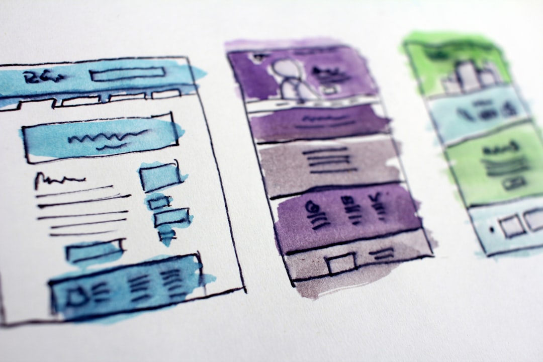
Finally, choose source files. Product UI belongs in Figma AI or the team’s design system. Page structure can begin in Framer. Social and email graphics can live in Canva AI. Diagrams can start in Napkin AI. When each source has a job, the page is easier to change after launch. That matters because the first live version is rarely the final one.
Framer, Figma AI, Canva AI, Napkin AI, Photoroom, and Gamma compared
| Page job | Best starting tools | Use it for | Human check |
|---|---|---|---|
| Page structure and live publishing | Framer | Campaign pages, waitlists, feature launches, webinar pages, and small product microsites that need to go live quickly. | Check forms, analytics, page speed, metadata, mobile layout, and whether the offer is clear above the fold. |
| UI evidence and product screenshots | Figma AI | Screenshot frames, interface states, component-consistent mockups, comparison panels, and product-story visuals. | Do not let AI invent features, numbers, integrations, customer logos, or states that are not actually shipped. |
| Campaign assets and page graphics | Canva AI, PhotoRoom, Remove.bg | Hero graphics, ad variants, social images, product cutouts, webinar banners, and email headers. | Keep text, prices, disclaimers, and claims editable until export; product images must stay truthful. |
| Explainers and diagrams | Napkin AI | Simple process diagrams, before/after flows, feature maps, onboarding graphics, and blog-to-page visuals. | A diagram should remove confusion, not decorate a weak message. Delete anything the reader does not need. |
| Sales narrative and internal review | Gamma, Beautiful.ai | Page outline, launch deck, sales enablement version, stakeholder review, and webinar-to-landing-page messaging. | Deck structure can inspire a page, but long slide claims rarely belong in the hero section. |
Framer is the strongest starting point when the bottleneck is publishing. A small team can draft sections, edit visually, connect a domain, and ship a responsive page without waiting for a full engineering cycle. It is especially useful for webinars, waitlists, creator products, agency campaigns, and fast experiments. The risk is that teams forget everything outside the canvas: event tracking, form delivery, image weight, search snippets, and legal copy.
Figma AI belongs closer to product truth. Use it to organize design files, create layout options, produce screenshot frames, and explore UI stories. The final screenshot should still come from a real state or approved mock. A landing page often lives or dies on whether the visitor trusts the product image. If the image feels fake, the page feels fake, even when the copy is honest.
Canva AI is useful for the assets around the page: ad creative, newsletter headers, partner banners, speaker cards, lead magnet covers, and launch graphics. The page itself may live in Framer, but the campaign needs surrounding visuals. Canva keeps non-designers moving, as long as brand kits and templates are locked enough to prevent drift.
Napkin AI turns text into diagrams, which is valuable when the offer has a process. A three-step diagram can explain a workflow better than a paragraph. Gamma and Beautiful.ai help turn the same message into stakeholder decks or sales enablement material. A mature team connects these tools through a single message sheet instead of rewriting the campaign from scratch in every format. Browse more options in the findaiverse AI tools directory when you need adjacent writing, search, or video tools.
A workflow from campaign idea to published page
Start with the campaign source. Is the visitor coming from search, paid social, a newsletter, a partner link, a webinar, an outbound email, or an in-product announcement? Source changes the page. Search visitors need clearer definitions and comparison context. Paid social visitors need faster problem recognition. Partner visitors need trust transfer. Existing users need direct next steps. AI cannot infer the source unless the brief says it.
Then draft the message sheet. Use one page: headline options, subheadline, three proof points, three objections, one primary CTA, one secondary CTA, and the assets available today. This sheet can be created with a writing tool, reviewed by the campaign owner, and then moved into Framer, Figma, Canva, or Gamma. The sheet prevents a common mistake: the page, ads, emails, and deck all using slightly different promises.
Create a low-fidelity page before polishing visuals. In Framer or Figma, block the hero, proof, workflow, comparison, CTA, FAQ, and footer. Keep the first version ugly enough that people discuss order and meaning rather than gradients. Once the sequence works, add screenshots, diagrams, product images, and brand treatments. This order feels slower for one hour and faster for the rest of the project.
Build reusable sections. A good testimonial card, security note, comparison row, pricing footnote, integration panel, FAQ item, and CTA strip can be reused across future campaigns. AI tools become more useful when they feed a small library of approved sections. Otherwise each page becomes a fresh design argument.
Before publish, run a live-page checklist. Submit the form. Test the thank-you state. Open the page on a phone. Compress images. Check contrast. Read the hero without the image. Verify every claim and number. Confirm UTM handling. Make sure the page title and description are not placeholders. Check that deleted AI copy did not leave odd phrases behind. Only then should traffic move from test to live.
Conversion checks: copy, proof, mobile, accessibility, and speed
Copy should be specific enough to disqualify the wrong reader. A landing page that tries to welcome everyone becomes weak for the person most likely to buy. Write the headline around the pain, role, or use case that triggered the visit. A developer tool page can say exactly what stack it supports. A finance workflow page can name close, reconciliation, audit, or approval. A creator page can show the output format and time saved. Plain beats vague.
Proof should come earlier than most teams place it. If a page asks for a demo, show evidence before the first serious CTA. Evidence can be a real screenshot, customer quote, usage number, integration list, security badge, workflow diagram, benchmark, or teardown. Do not fake proof with stock dashboards. If proof is thin, be honest and lower the ask: waitlist, sample download, free audit, or product tour.
Mobile should be treated as a separate design review. Long hero copy, wide comparison tables, tiny screenshot labels, and oversized decorative images break quickly on phones. Follow practical guidance from Google Web Vitals and accessibility basics from W3C accessibility resources. You do not need a perfect score for every experiment, but you do need a page that loads, reads, and works.
Speed is not only a technical metric. Slow pages damage the emotional promise of the product. If you claim to save teams time and your landing page loads like a heavy brochure, the visitor notices the contradiction. Compress hero images, avoid unnecessary animation, keep third-party scripts under control, and test on a normal phone connection rather than an office fiber line.
The final conversion check is alignment. The ad, email, or search result should sound like the page. The page should sound like the product. The product should deliver what the CTA implies. AI tools can make each asset independently polished; the team has to make them agree.
Recommended stacks by team type
A seed-stage SaaS startup should keep the stack narrow: Figma AI for product visuals, Framer for campaign pages, Canva AI for surrounding graphics, and Gamma for investor or sales versions of the same story. Add Napkin AI when the product is hard to explain. Avoid five separate page tools. The main risk is version confusion, not lack of creativity.
A content-led business should start with the editorial calendar. Each major article can produce a companion page, lead magnet, webinar page, diagram set, and social pack. Use Napkin AI for diagrams, Canva AI for graphics, Framer for the lead capture page, and Figma for any product UI. The article and page should share the same internal link plan so readers move from education to action.
An agency needs tighter source records. Store prompts, source images, page exports, client approvals, and final URLs per client. Use Framer for fast microsites when scope allows, Figma for design systems and product UI, Canva when the client will maintain the campaign, and Gamma for review decks. Do not mix client references in shared AI accounts.
An ecommerce team should be conservative with product visuals. PhotoRoom, Remove.bg, Canva AI, and Framer can produce clean product landing pages quickly. The product, bundle, material, size, and price must stay true. If the generated page makes a product look larger or more premium than it is, the conversion gain may turn into returns and support tickets.

A privacy-sensitive B2B company should reduce uploads. Keep confidential screenshots inside approved tools, use generic abstract visuals when possible, and review vendor data policies before feeding roadmaps or customer material into an AI assistant. The page can still move fast. It just needs a smaller circle of tools and a stronger habit of redacting sensitive assets.
Field notes from findaiverse curation
While curating design tools for findaiverse, we see a clear split between demo value and operating value. Demo value is the page that appears from a prompt. Operating value is the second week: can the team edit it, reuse sections, fix copy, update forms, export images, explain source files, and publish the next variant without starting over? Tools that survive in teams usually solve the second week.
Another pattern: the best pages often use less AI in the final visible layer than people expect. AI helps with first options, section ordering, diagrams, and asset cleanup. The final headline, proof, customer promise, pricing note, and screenshots are usually more human. That is not a weakness. It is the right division of labor.
Disclosure: findaiverse lists free and paid AI tools, but this article is editorial guidance, not a paid placement. Features, pricing, data policies, and commercial terms change often. Check current vendor pages before standardizing a workflow, and use the Design tools hub or the full findaiverse directory to compare adjacent tools in writing, productivity, image generation, and search.
FAQ
What is an AI landing page design workflow?
An AI landing page design workflow is a repeatable process for turning a campaign brief into a public page with AI-assisted drafting, design, imagery, diagrams, and publishing. It covers the brief, tool roles, source files, conversion copy, proof assets, mobile checks, accessibility, tracking, and post-launch updates.
Which AI tool is best for landing pages?
Framer is a strong starting point when you need to publish a responsive page quickly. Figma AI is better for product UI and design-system assets, Canva AI for campaign graphics, Napkin AI for diagrams, and Gamma for shaping the sales narrative. The best choice depends on the bottleneck.
Can AI-generated landing pages be used for paid ads?
Yes, but only after a careful review. Check the offer, claims, screenshots, form behavior, page speed, mobile layout, privacy text, tracking, and source rights. Paid traffic makes small mistakes expensive, so treat AI output as a draft rather than a finished page.
How do teams keep AI landing pages on brand?
Use one page brief, approved templates, locked brand assets, real product screenshots, reusable sections, and a named reviewer. Keep text and claims editable until final publish. Save prompts and source files so successful pages can be repeated instead of recreated from memory.
Final recommendation
AI can make landing page production faster, but only if the team keeps the promise, proof, and publishing checks under control. Start with a brief, choose each tool by job, and ship with a boring checklist. For the next stack decision, compare Framer, Figma AI, Canva AI, and related tools in the findaiverse Design hub before adding another subscription.